
Color is one of the most powerful tools in a designer’s arsenal. It can evoke emotions, convey messages and even influence behavior. Color theory is an important part of creating a successful poster design that should not be overlooked. In this blog post, we’ll explore the basics of color theory and how you can use it to improve your poster.
Basics of Color Theory
Understanding the Basics of Color Theory
Understanding the fundamentals of color theory is crucial before learning how to apply it to improve your poster design. Color theory, which is based on the color wheel, is concerned with the basic, secondary, and tertiary colors. Considering that they cannot be made by mixing other hues, the primary colors of red, blue, and yellow are those three. In order to create a secondary color, primary colors like green, orange, and purple can be blended. Two primary colors paired with a secondary color result in shades like yellow-green, blue-violet, and red-orange.
The terms hue, saturation, and value are also used in color theory. Hue is a term that describes the real color, such as red, blue, or green.
Saturation refers to the intensity or purity of the color, ranging from vivid to muted. Value refers to the lightness or darkness of the color, ranging from white to black.
Using Color Theory to Enhance Your Poster Design
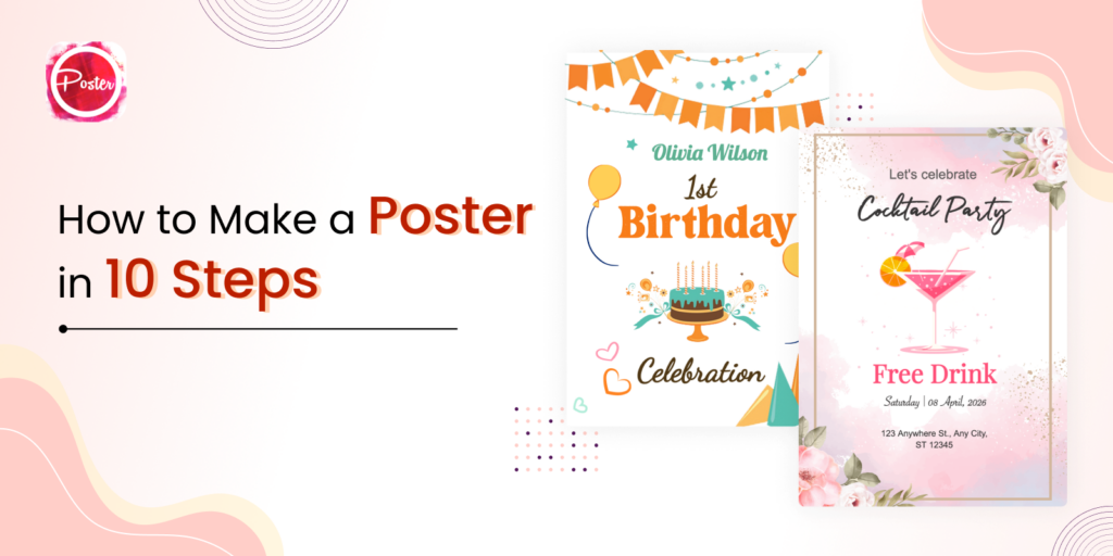
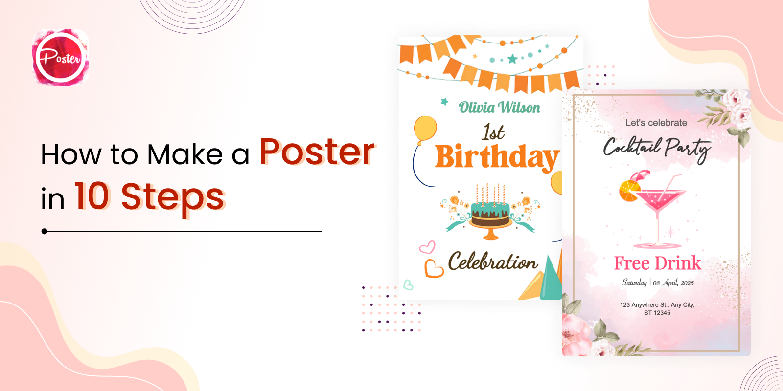
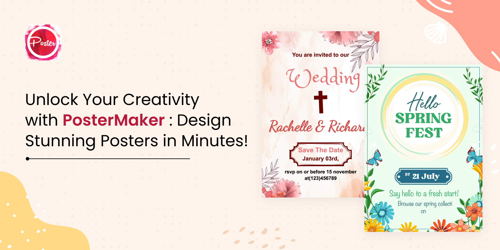
Now that we understand the basics of color theory, let’s explore how to use it to enhance your poster design. You can also take the help from poster maker and flyer maker tools and mobile apps.
Consider the Message
The first step in using color theory to improve your poster design is to think about the message you want to convey. Different colors evoke different emotions and can convey different messages. For example, red is often associated with passion, excitement and urgency, while blue is associated with calm, confidence and professionalism. Yellow is often associated with happiness, optimism and energy, while green is associated with growth, nature and sustainability.
When choosing colors for your poster, think about the message you want to convey and choose colors that match that message.
Use Contrast to Create Hierarchy
Contrast is an important part of all design, including poster design. Contrast can help create visual hierarchy and draw attention to important information. One way to use contrast is to use complementary colors, which are colors opposite each other on the color wheel, such as red and green or blue and orange.
Using complementary colors in poster design can create a high contrast that draws the eye and creates a clear hierarchy of information. Complementary colors should be used sparingly, as too much contrast can be overwhelming.
Use Color to Create Emphasis
Specific information in a poster design can be highlighted and called out using color. In your call to action or main message, you can achieve this by using a vivid, bold color. When designing a poster for a music festival, for instance, you can draw attention to the festival by using a vivid and bold color, like red or yellow, in the festival’s name.
Consider Color Harmony
Color harmony refers to the way colors work together in a design. There are several different color harmonies, including monochromatic, analogous, and complementary. Monochromatic color schemes use different shades and tints of the same color, while analogous color schemes use colors that are adjacent to each other on the color wheel. Complementary color schemes use colors that are opposite each other on the color wheel.
Consider the kind of harmony you want to achieve when picking a color scheme for your poster design. Analogous color schemes can produce a harmonious and natural feeling, whilst monochromatic color schemes can produce a serene and cogent design. A dramatic and high contrast impact can be produced by complementary color schemes.
Use Color to Create Depth and Dimension
Color can also be employed to give your poster design depth and dimension. You may add depth and make your design feel more dynamic by utilizing different tints and hues of the same color. For example, you might use a lighter shade of blue in the background of your poster and a darker shade of blue for the foreground elements to create a sense of depth.
Be Mindful of Accessibility
When using color in poster design, it’s important to consider accessibility. About 1 in 12 men and 1 in 200 women have some form of color blindness, which can make it difficult to distinguish certain colors. Choose enough contrasting colors to make your design approachable and don’t rely solely on color to convey important information. Use text, symbols, or other visual cues to make sure everyone understands the message you’re trying to convey. You can also use the website for stylish font like cool symbol fonts.
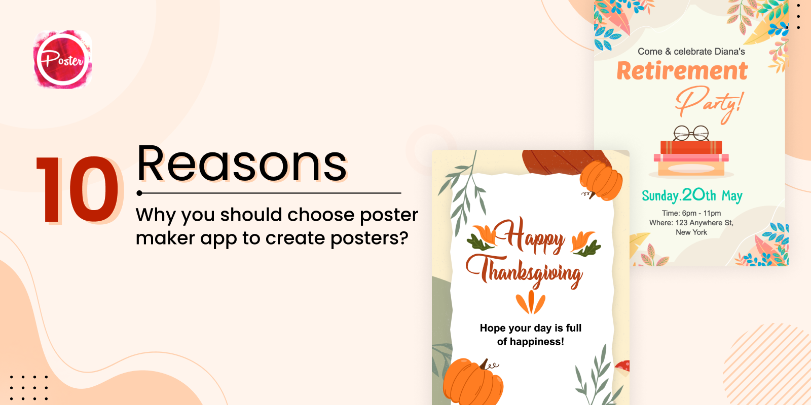
Color theory is a powerful tool that can enhance your poster design and communicate your message effectively. By understanding the basics of color theory and using it to create contrast, emphasis, harmony, depth, and accessibility, you can create a visually appealing and impactful poster design. Remember to consider the message you want to communicate, use contrast to create hierarchy, use color to create emphasis, consider color harmony, use color to create depth and dimension, and be mindful of accessibility when using color in your poster design. With these tips, you’ll be on your way to creating stunning and effective poster designs. There are number of online poster maker tools and apps for creating the stunning posters.