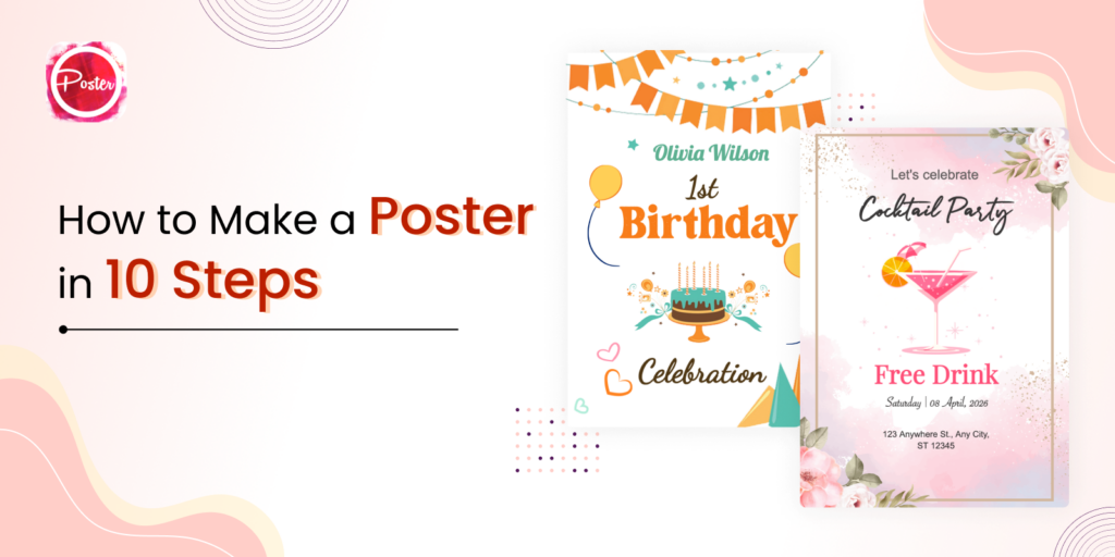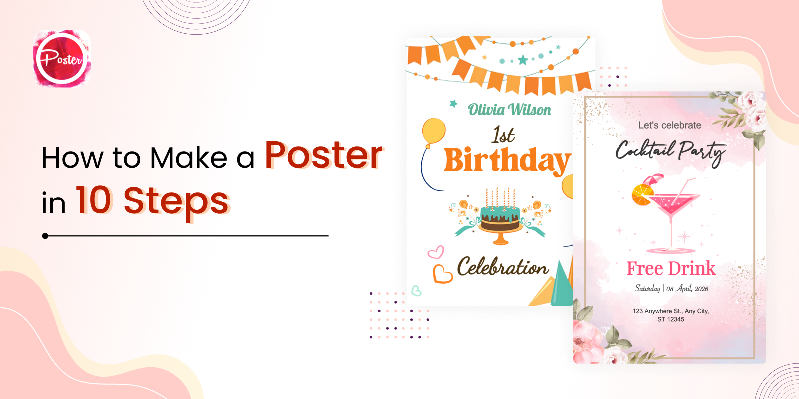

The choice of right font is one of the most important decisions you’ll make while creating posters. The font you select can have a big impact on how your audience will perceive your poster. It can convey different emotions, set the tone for your message, and even impact how your poster is read. In this blog, we’ll go through some key ideas and points to think about while selecting the ideal font for your posters. You can take idea from poster maker and flyer maker tools and website and get the number of templates for design invitation card, flyer and posters.
How to Choose the Right Font for Your Posters
1. Legibility is Key
First and foremost, legibility is the most crucial factor to keep consideration when choosing a font for your poster. You want to make sure that your audience can read the text on your poster, even from a distance. Avoid using overly ornate or complicated fonts that may be difficult to read. Instead, pick legible, easy-to-read fonts that are neat and clear.
Consider the size of your text as well. If your poster will be viewed from a distance, you may need to use a larger font size to ensure legibility. On the other hand, if your poster will be viewed up close, you can use a smaller font size. There are many online poster maker and flyer maker website, you can choose the best template.
2. Consider the Tone and Message of Your Poster
The right font you choose can also convey the tone and message of your poster. Different fonts can evoke different emotions and feelings. For example, a bold, sans-serif font may convey a sense of strength and confidence, while a script font may feel more elegant and sophisticated.
Keep into consideration the message’s tone and the feelings you want your viewers to feel after looking at your poster. If your message is serious and informational, you may want to choose a more traditional font. If your message is playful and fun, you may want to choose a more whimsical font.
3. Use Hierarchy to Guide the Eye
Hierarchy is an important design principle that can help guide the viewer’s eye through your poster. Hierarchy refers to the arrangement of different elements on the page, with the most important elements given the most prominence.
One way to use hierarchy is to vary the font size and style of different elements on your poster. For example, you may use a large, bold font for the headline, a smaller font for the body text, and an italicized font for quotes or other supporting text. This can help guide the viewer’s eye through your poster and highlight the most important information.
4. Don’t Use Too Many Fonts
While it can be tempting to use a variety of different and right font on your poster, it’s best to keep it simple. Using too many fonts can make your poster look cluttered and confusing. Stick to one or two fonts at most, and use them consistently throughout your poster.
Consider using different variations of the same font to add variety without overwhelming your design. For example, Use a bold font for headlines and a regular font for body text.
5. Consider Contrast
Contrast is another important consideration when choosing a font for your poster. Contrast refers to the difference in color or weight between different elements on your poster. For example, using a white font on a dark background creates a high contrast, which can be attention-grabbing and easy to read.
Consider using contrast to highlight important information or create visual interest. For example, using a bold, black font on a light backdrop for the headline, or a button with a vibrant, eye-catching typeface, for instance, can make a statement.
6. Consider Branding
You may want to consider about using the brand’s right font while designing a poster for a business or organization. This can help reinforce the brand’s identity and create a cohesive look across all marketing materials.
Make sure to check with the brand’s style guide to ensure that you are using the correct fonts and following any guidelines for their use. If the brand does not have specific fonts, consider choosing fonts that reflect the brand’s personality and values.
7. Test Your Right Font Choices
Before finalizing your poster design, it’s important to test your font choices. Print out a copy of your poster or display it on a screen at the size it will be viewed, and evaluate the legibility and overall look of your design.
Consider showing your design to others and soliciting feedback on the font choices. They may be able to offer valuable insights and suggestions for improvement.
8. Use Web Safe Fonts for Online Posters
If you are creating a poster to be displayed online, it’s important to use web-safe fonts. These are fonts that are frequently found on the majority of gadgets and operating systems, making sure that your design will look consistent and understandable on many gadgets.
Arial, Helvetica, Times New Roman, and Verdana are popular web-safe fonts. Make sure to check that the font you choose is web-safe before finalizing your design.
In conclusion, choosing the right font for your posters is an essential part of the design process. By considering legibility, tone and message, hierarchy, font variety, and contrast, you can create a poster that effectively communicates your message and engages your audience. You have no trouble choosing the perfect font for your next poster design if you keep these suggestions in mind.
Poster App Lab is the best poster maker and flyer maker website and mobile app for creating stunning design of posters.