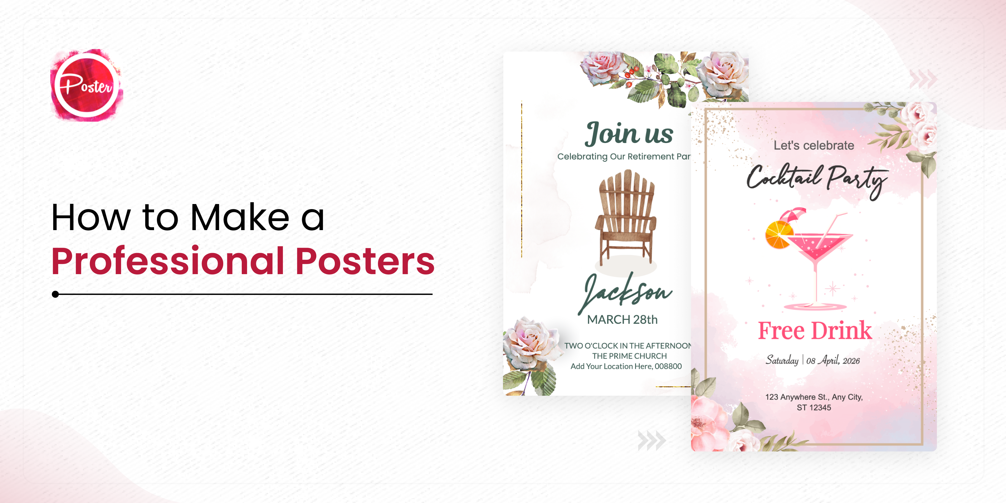
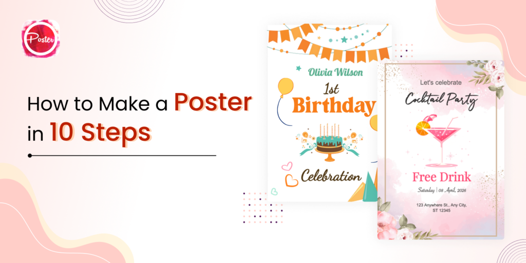
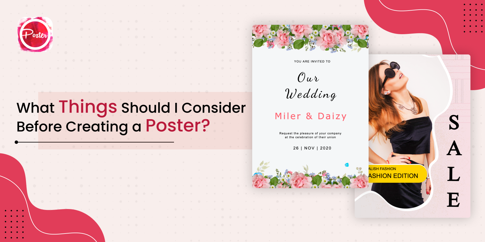
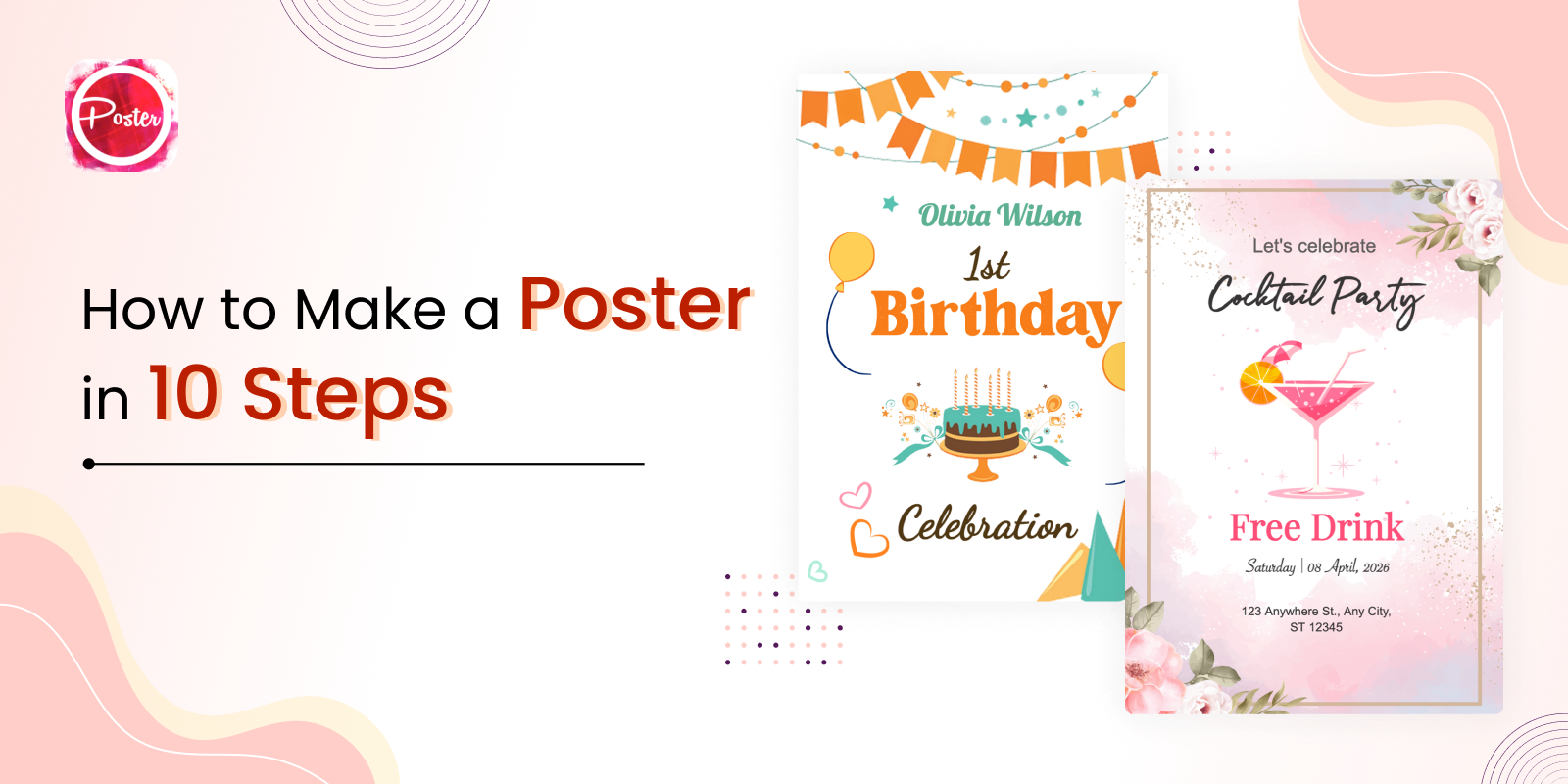
Posters are a powerful visual medium that can convey messages, promote events, and capture attention. Whether you’re a business owner, event organizer, student, or simply someone with a creative spark, the ability to create professional-looking posters is within your reach. In this blog post, we’ll explore practical tips and techniques to make professional posters that will empower anyone, regardless of their design background, to create stunning posters that make an impact.
Tips and Techniques to Make a Professional Posters
Start with a Clear Objective
Before diving into the design process, define the purpose of your poster. Are you promoting an event, selling a product, or raising awareness? Understanding your objective will help you make design decisions that align with your goals.
Choose the Right Poster Maker Tool
Thanks to the availability of user-friendly poster maker tools, you don’t need to be a design expert to create professional-looking posters. Find a tool that offers a wide range of templates, fonts, graphics, and customization options to suit your needs.
Plan Your Layout
A well-organized and visually pleasing layout is crucial for an effective poster. Consider the hierarchy of information and arrange your content accordingly. Use a grid or guidelines to ensure alignment and balance in your design.
Select an Eye-Catching Color Palette
Colors evoke emotions and attract attention. Choose a color palette that aligns with your message and brand. Use contrasting colors to create visual interest, and remember to maintain readability by selecting colors that provide sufficient contrast between text and background.
Typography Matters
Selecting the right fonts can significantly impact the overall look of your poster. Stick to a maximum of two or three fonts to maintain consistency and readability. Fancy fonts, cool symbols and Pair fonts with complementary styles (e.g., a bold headline font with a clean and legible body font) for a professional touch.
Use High-Quality Images
Images are powerful visual elements that can enhance the impact of your poster. Choose high-resolution photos or illustrations that are relevant to your message. Ensure the images are clear, well-lit, and properly sized to maintain quality.
Incorporate White Space
Don’t overcrowd your poster with too much content. Embrace white space (empty areas) to give your design room to breathe. White space helps focus attention on key elements and improves readability.
Maintain Consistency
Consistency is key to creating a professional-looking poster. Use a consistent color scheme, font styles, and visual elements throughout your design. This cohesive approach will make your poster appear polished and well thought out.
Pay Attention to Details
Review your poster for any spelling or grammatical errors. Check for alignment issues, font sizes, and image placement. Paying attention to these small details will ensure a professional finish.
Print and Share
Once your poster is complete, save it in the appropriate file format (PDF or high-resolution image) for printing or sharing digitally. Ensure you choose the correct dimensions and resolution for your intended use.
Creating professional posters no longer requires extensive design knowledge or skills. With the availability of user-friendly poster maker tools and the implementation of key design principles, anyone can produce visually appealing and impactful posters. By following the tips outlined in this blog post, you’ll be well on your way to creating stunning posters that capture attention, convey your message effectively, and leave a lasting impression. So, go ahead, unleash your creativity, and let your poster-making journey begin!
Remember, the process of creating professional posters is not limited to design principles alone. It’s also about understanding your target audience, capturing their attention, and effectively conveying your message. By keeping your objective in mind, selecting the right tools, and implementing the tips and techniques discussed, you’ll be able to create posters that stand out from the crowd.
Once your poster is complete, it’s time to print and share it with the world. Consider the appropriate printing options based on your budget and desired quality. Whether you’re distributing physical copies or sharing your poster digitally on social media platforms or websites, make sure it reaches your target audience.
Don’t be afraid to seek feedback from others. Share your poster with friends, colleagues, or online design communities to gather valuable insights and suggestions for improvement. Constructive criticism can help refine your design skills and enhance the overall impact of your posters.
Lastly, remember that practice makes perfect. The more you experiment with design elements, explore different techniques, and create posters, the more your skills will evolve. Embrace the learning process, stay updated on design trends, and continuously seek inspiration from other designers to fuel your creativity.
So, whether you’re promoting an event, launching a new product, or simply expressing your creativity, creating professional posters is within your grasp. Start by applying the tips and techniques discussed in this blog post, and enjoy the process of bringing your ideas to life through visually captivating posters.
